
I used to work with icon-fonts, much time. Lots of projects ( Site or applications) really need a system for icons, and icon-fonts offer a very fine system. But there is an another alternative to reference an icon : using inline SVG and the <use> element .
Whether it’s icon-fonts or SVG sprites you use as icon sets in your application is your decision. However, we’ll cover some advantages that SVG sprites have, but most importantly how you can implement them in Angular.
Why an SVG sprite icon system?
- SVGs don’t experience the problem of anti-aliasing like fonts do, so your icon will always be crisp
- You can manipulate different elements within an SVG
- Multi-colour support
- More & easier control over the positioning of an icon (fonts are under the influence of
vertical-align,line-height,letter-spacing,word-spacing, …)
Setup
1. Icon set
First, we need an icon set. (Combining the .svg files).
Let´s do it manualy. First we create a file named icons-defs.svg (we can give any name to the svg file).
The content of the file should just be an <svg> tag, with a <defs> tag (which just means you are defining stuff to use later), and then a bunch of <symbol> tags. Each <symbol> tag will have a unique ID, and will wrap all the paths for each icon.
<svg>
  <defs>

    <symbol id="shape-icon-1">
      <!-- all the paths and shapes and whatnot for this icon -->
    <symbol>

    <symbol id="shape-icon-2">
      <!-- all the paths and shapes and whatnot for this icon -->
    <symbol>

    <!-- etc -->

  </defs>
</svg>
As we see, we can do that by hand, but of course that’s a bit laborious. And there are lot of tools who can assist us to generate our icon-set more quickly.
Another way: IcoMoon
We will use icomoon to create an icon-set. Go to icomoon’s website and click on the purple button “IcoMoon App”.

Next, click on “Generate SVG & More”.

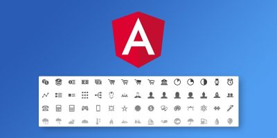
Now we can download the generated SVG icon set

When the download is successful, let´s unzip the file. There is a file called symbol-defs.svg. This is the SVG sprite we’re going to use. So copy & paste this file inside src/assets folder of the Angular app.
We now have everything set up to use the icon set, and we can use it like this:
<svg> <use attr.xlink:href="assets/symbol-defs.svg#icon-images"></use> </svg>if we start the app right now, we should see the following.

Explanation:
We created all necessary html tags to display an SVG image inline, but with a twist. We defined that our source is assets/symbol-defs.svg, which is our sprite file. We didn’t want to show every single icon in our sprite so we defined which icon we wanted to show. We managed this by suffixing our source with #icon-images. Whenever we want to change our icon we just change the suffix to the name of the icon that is defined in our SVG sprite file.
2. Implementation time
Let us create a new component file called: svg-icon.component.ts, and add the following content.
import { Component, Input, OnInit } from '@angular/core';

@Component({
  selector: 'bvg-icon',
  template: '<svg> <use attr.xlink:href="assets/symbol-defs.svg#{{icon}}"></use> </svg>',
  styleUrls: ['./icon.component.scss']
})
export class IconComponent {

  @Input() icon: string;

}
we use an @Input for the icon name. By doing this everybody who consumes this component can define which icon they need.
Next, register our new component to the app.module.ts file.
import { BrowserModule } from '@angular/platform-browser';
import { NgModule } from '@angular/core';

import { AppComponent } from './app.component';
import { IconComponent } from './bvg/components/icon/icon.component';

@NgModule({
  declarations: [
    AppComponent,
    IconComponent
  ],
  imports: [
    BrowserModule
  ],
  providers: [],
  bootstrap: [AppComponent]
})
export class AppModule {
}
Finally,we can use our icons that way: (ps: Be aware of the component selector above)
<bvg-icon icon="icon-notification_summary"></bvg-icon>If we want to change the dimensions of our icons we have to apply these on the svg tag. This means that our styling would look like this.
bvg-icon { // component tag
  svg {
    display: inline-block;
    width: 20px;
    height: 20px;
  }
} PS: This isn’t an ideal situation. You should be able to consume the svg-icon as if it’s the icon on it’s own. We want to apply styling on the component tag and be done with it. Other components who consume this component should’t need to know the internal implementation. We can solve it like this:
in the icon.component.scss file:
:host {
  display: inline-block;

  svg {
    display: inline-block;
    all: inherit;
  }
}
What we are doing here is saying, every single style that is applied to our component itself , should apply as well on the svg tag.
Its mean, if we now give the bvg-icon tag a width, height and fill color, our SVG will inherits all the styling.
 <bvg-icon icon="icon-radio_speaker_volume_control"
       style="width: 32px; height: 32px; fill:#c00">
 </bvg-icon>
Be aware that the all property isn’t supported in IE and Edge. If you need support for them you must inherit every single property separately. Next to this you’ll also need a polyfill (svg4everybody) for the SVG support.