
1 – <ng-template></ng-template>
As the name suggests the <ng–template> is a template element that Angular uses with structural directives ( *ngIf , *ngFor , [ngSwitch] and custom directives). These template elements only work in the presence of structural directives, which help us to define a template that doesn’t render anything by itself, but conditionally renders them to the DOM.
 <div *ngIf=”condition==false ; else showNgTemplateContent”>
      Shouldn't be displayed
  </div>


<ng-template #showNgTemplateContent> Should be displayed
</ng-template>
In the above example, If the condition is false then we will show the text as “Shouldn’t be displayed” else will show ng-template content as “Should be displayed”
2- <ng-container></ng-container>
ng-container is an extremely simple directive that allows you to group elements in a template that doesn’t interfere with styles or layout because Angular doesn’t put it in the DOM.
This is helpful if you don’t want any extra div on DOM, you can simply use
ng-container. For eg: If there are two structural directives are being called on one div as below:
<div *ngIf="details" *ngFor="let info of details">
  {{ info.content }}
</div>
Attempting to compile this code will result in the following error:
Can't have multiple template bindings on one element. Use only one attribute prefixed with *One workaround would be to separate the bindings as below:
<div *ngIf="details">
  <div *ngFor="let info of details">
    {{ info.content }}
  </div>
</div>
Or we can use <ng-container> without adding any extra element to the DOM at runtime:
<ng-container *ngIf="details">
  <div *ngFor="let info of details">
    {{ info.content }}
  </div>
</ng-container>
3- <ng-content></ng-content>
ng-content is used to project content into Angular components. You use the <ng-content></ng-content> tag as a placeholder for that dynamic content, then when the template is parsed Angular will replace that placeholder tag with your content. This is well known as Content Projection.
in others words,They are used to create configurable components. This means the components can be configured depending on the needs of its user.
PS: Components that are used in published libraries make use of <ng-content> to make themselves configurable.
Consider a simple <project-content> component:
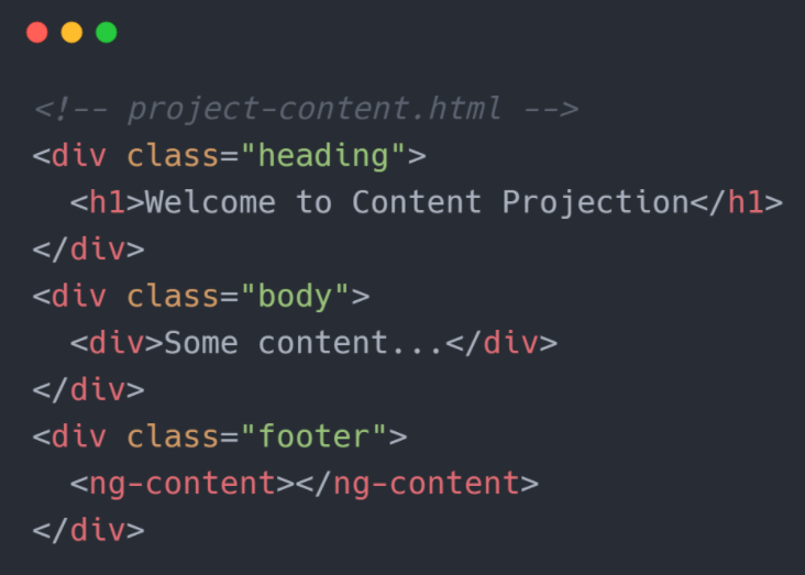
In parent.component.html, <project-content> selector is used to show data of Project-content component

The HTML content passed within the opening and closing tags of <project-content> component is the content to be projected. This is what we call Content Projection. The content will be rendered inside the <ng-content> within the component.
This allows the parent component of <project-content> component to pass any custom footer within the component and control exactly how they want it to be rendered.
PS: In the example above, we set a single content projection, but we can also make multiple projections.
Multiple Projections:
Instead of every content projected inside a single <ng-content>, you can also control how the contents will get projected with the select attribute of <ng-content>. It takes an element selector to decide which content to project inside a particular <ng-content>
Here’s how:

We have modified the <project-content> definition to perform Multi-content projection. The select attribute selects the type of content that will be rendered inside a particular <ng-content>. Here we have first select to render header h1 element. If the projected content has no h1 element it won’t render anything. Similarly the second select looks for a div. The rest of the content gets rendered inside the last <ng-content> with no select.
Calling the component from the parent component will look like:
